Drawings for Crazy Horse

Originally published January 26, 2010 by CityArts

Crazy Horse Among Falling Stars by Tony FitzpatrickI have long been a fan of Tony Fitzpatrick’s eccentric and obsessive etchings. In the past he has turned his attention and finely-tuned hand to obsess on birds, bugs, hobo alphabets and the poetry of cities. In recent years he has moved increasingly into a new visual and conceptual universe, using collage to channel his obsessions into the visible world.

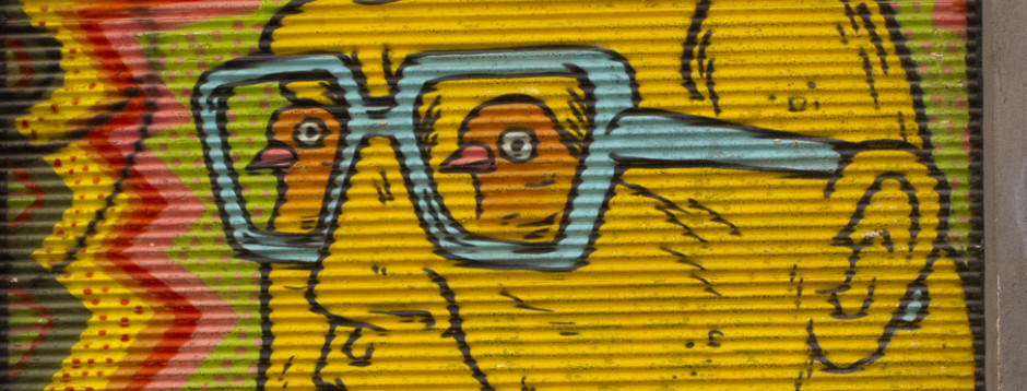
Fitzpatrick’s most recent show, at Pierogi Gallery in Williamsburg, is an interesting musing on the life of Crazy Horse. A cacophony of collaged images, many of which seem more autobiographical than biographical, crowd into the small drawings. The largest is roughly 10-by-7 inches, yet all are bursting with narrative, color and image. They are remarkable, the combination of size and density of color and image drawing the viewer into Fitzpatrick’s universe. The use of collaged materials has changed the artist’s palette. Though the work is both beautiful and seductive, I have to confess a longing for a greater presence of his “hand.” One of the best things about Fitzpatrick’s earlier prints were his extraordinary bold, funny and desperate hand-drawn lines.

Fitzpatrick is an artist who never sits still, and though I did not swoon over this body of work as I have in the past, the collages are thoughtful, worthy and wonderfully nuts. It is very telling that in the press release for this show Fitzpatrick readily acknowledges little knowledge of American Indian history or life and proclaims little kinship with the subject. But what fascinates the artist about Crazy Horse reveals much about Fitzpatrick; it is Crazy Horse’s unease in the world. Fitzpatrick describes him as a “seeker,” a man of both courage and “otherworldliness,” both an American iconoclast and an enigma. A portrait of the artist as a young Indian?

Through Feb. 7. Pierogi, 177 N. 9th St. (betw. Bedford & Driggs Aves.), Brooklyn, 718-599-2144.

Posted in Reviews | Leave a comment

Ending the Year on a Outside Note

orig. published December 30, 2009 by New York Press

Two very different exhibits with some similar ideas

David Dunlap Project #28

.

David Dunlap’s “Project Book #28.”

Two gallery shows in wildly disparate locations end 2009 on an interesting note. The first, on the outer edges of Red Hook, shows a diverse cross section of young Brooklynites. The second, in the heart of Chelsea, shows us the work of a mature but decidedly outsider artist working steadfastly for years with a uniquely personal vision.

Kidd Yellin Gallery is perched on a dead-end Red Hook street, almost in the river. It’s as “out there” as you can get and still be in New York City. The gallery has put together “The Kings County Biennial,” a huge, 48-artists show, culled from those working throughout Brooklyn.
While there are several noteworthy individual works, the show lacks an over-arching curatorial theme and is a bit of a conceptual mess; there’s a little bit of everything and it feels a wee bit frantic. Each of the artists has one piece in the show, though I felt it would have been a stronger show had there been half as many artists, each represented by more pieces. Still, there were a couple of standouts. Eric Fertman’s elegant sculpture entitled “Tower” is reminiscent of post-war modernism. Constructed of stained oak, it exhibits gorgeous craftsmanship and a feeling for form traveling through space. Similarly simple in appearance is a painting by Alejandro Cardenas. Entitled “Special Forces,” it is a haunting and affecting portrait of a mass of burka-shrouded women rendered as a landscape of staring eyes. It’s a powerful image, at once political and beautiful.

The other piece that impressed me was a video by Meredith James, which demonstrates real narrative and filmmaking skill. A surveillance monitor placed in a ridiculously small office, dating from a past era, and plays a continuous loop of a video about the same office and the security guard tormented by a constantly ringing telephone. Better yet, the monitor is placed in the office set in which the film takes place, providing a physical context that makes the sculpture work on several levels. It’s mysterious, funny and a little twisted—a recipe for great art.

Miles away, on one of the chic streets of Chelsea, one enters another “out there” place, but this by dint of concept rather than location. The Cue Foundation is presenting the New York debut show of David Dunlop. Dunlop, a resident of Iowa City, has been working on his idiosyncratic and very personal vision for over 20 years. Using sculpture, text, found objects, installation and photography, Dunlop lays bare both his life and artistic process. Though university educated, Dunlop is arguably a true outsider artist. The complexity and fully realized nature of the universe he inhabits is completely outside of mainstream art. It is funny, meaningful, provocative and utterly original.

The gallery is hung ceiling to floor with drawings, photographs, altered clothing and homemade calendars. In the center of the space is a big wooden cabin that houses, inside and out every single handmade book the artist has created since the 1970s. Recurrent themes echo throughout the enormous show—Martin Luther King, calendar dates, flags and politics. Dunlop does not have an agenda to pursue with all of these subjects. It’s more like a view inside of one man’s complex mind- obsessive phrases and imagery; the things that a mind latches onto and plays with verbally and figuratively. Operating on several levels, it is a show that deserves a very close look.

All in all, two very interesting ways to end the year.

> The Kings County Biennial
Through Feb. 26, Kidd Yellin Gallery, 133 Imlay St. (at Verona St.), Brooklyn, 917-860-1147.

>David Dunlap
Though Jan. 7, The Cue Foundation, 511 W. 25th St. (bet. 10th & 11th Aves.), 212-206-3583.

Posted in Reviews | Leave a comment

Carroll Dunham

Originally published December 3, 2009 by CityArts

What To Catch At Snatch: The first show at Brooklyn’s Snatch Block ProjectsCarroll Dunham is a naughty boy. His current exhibition, at the Barbara Gladstone Gallery, is a meditation, shall we say, on two female orifices. This is a disappointing exhibition from a gifted artist of whom I have been a huge fan. In the past, Dunham’s drawings and paintings of our chaotic universe—angry men, guns, organs and cities—have embodied, along with their anger, a hysterical sense of humor. Dark and funny, he portrayed a cartoon world that also dove into the modern psyche.

His current paintings fall short. How many holes do you want to stare at? Gone is a sense of humor and irony. These paintings, most of which are titled “Hers,” seem to want to recreate the kind of male obsession reminiscent of early 20th-century painters who painted the female nude over and over again. But Picasso and Matisse were experimenting with light, color and composition as well as examining the female form. Dunham has rendered everything nearly flat, both in perspective and paint quality. The focus is front and center on the two orifices, with an occasional detour past a giant nipple. The images just don’t transcend a kind of cartoon fantasy world. I wish they did.

Every now and then, one of the exhibition’s paintings moves beyond its organs, and there is a lyrical play between the abstracted forms to which the body is reduced. And these paintings—“Hers (Night and Day #4)” and “Hers (Night and Day #6)”—are really interesting. In these two works, Dunham allows his brilliance with the drawn line to emerge. The surfaces are not quite as dimensionless or opaque, and hints of wandering line and brushstroke enliven the surfaces. Coincidently they are both breast paintings, where the organ is slightly off center. By not being so in-your-face with their content, these paintings let the viewer breathe a little. They become an interesting and humorous element in a larger, well, whole.

Posted in Reviews | Leave a comment

Of Land

Originally published November 3, 2009 by CityArts

What To Catch At Snatch: The first show at Brooklyn’s Snatch Block ProjectsKris Graves Projects, a Dumbo gallery, has just opened “Of Land,” a fresh and visionary exhibition show of landscape photography. This elegantly curated show consists of 11 photographers whose diverse visions cover a wide of landscape and printing techniques. The photos range from the lush velvet of vintage platinum prints to the harsh colors of an “archival pigment print” and everything in between. The diversity of printing technique is fitting for a show that also ranges so far and wide in its portrayal of landscape.

There is an underlying sense of stillness to the entire show. Granted, a photograph renders the world still, but there is in this show a consistent quietude that runs through all of the works. It took me a minute to adjust my New York head to this silence. The pay off is worth the time.

I loved Victor Shrager’s portraits of giant masses of butter—“Monument (2)” and “Monument (477)” that look like brilliant yellow icebergs. Beautiful and funny, they are placed on the gallery wall next to Laura McPhee’s photos of monumental steam clouds rising from a devastating forest fire, beautiful and brutal, a nice counterpoint to the butter glaciers.

Jed Devine is represented here by two pieces—“ Fireworks, Oak Bluffs, Martha’s Vineyard” and “Battery Park City Landfill, New York Early 1980s”—that differ in subject matter but share the same technique. Each is 43 inches long and made up of a series of smaller sequential photographs. Artfully collaged, they each portray a long horizontal landscape. One, almost pitch black, captures a burst of fireworks above a small town. The other, blindingly brilliant, is of a landfill in lower Manhattan, the giant depression in the ground gently rimmed by machines. Each is achingly poetic, and once again the gallery has made a little bit of magic happen in the placement of the works.

Posted in Reviews | Leave a comment

Something In The Water

Originally published October 20, 2009 by New York Press

What To Catch At Snatch: The first show at Brooklyn’s Snatch Block ProjectsSomething In The Water A fantastical gallery opens on a ho-hum NYU block

The Esopus Creek is a renowned trout fishing stream that flows through the Catskill Mountains into the Ashokan Reservoir, a principle water source for New York City. It is also the name of a non-profit foundation, a magazine and now a gallery that all celebrate the quirky, literate and inspired vision of its founder, Tod Lippy. I have long been a fan of the biannual magazine, each issue of which is an artwork itself, full of the most unexpected objects ever to be found in a magazine. Various issues have contained pages that are dye cut or burned, inserts of strings, plastic or rubber, books within a book, and CDs of music or “found” sounds. Each issue is both printed and hand constructed; how the hell Lippy actually gets the damn things produced is anyone’s guess.

It was with great delight then that I greeted the news that The Esopus Foundation had opened a gallery space in NYC. Consistent with the Esopus tradition of reveling in the unexpected, the gallery space is in a weird 1980s-era building near the NYU campus, not near any other gallery, not in a neighborhood that’s cool or even un-cool. It sits in the midst of student falafel joints and wannabe dive bars like that glorious found object you discover on trash night.

The current exhibition, Dwight Ripley:

Travel Posters is a perfect component of the Esopus universe. The most glorious, gorgeous drawings that I have seen in a long while have, of course, a fascinating backstory that adds to their mystic.

Dwight Ripley was a major part of the post-war New York cultural scene. He was the financial backer of the Tibor de Nagy Gallery and part of the social circle that included Clement Greenberg and Peggy Guggenheim. His passion, however, was the search and discovery of new and exotic plants. He and his companion Rupert Barney traveled the world for years discovering 74 plant species that now live in the New York Botanical Garden.

After his death in 1973 a trunk was discovered that contained the 13 drawings that comprise this exhibition. They are “travel posters” that chronicle a specific plant-gathering trip through Spain and Portugal in 1962. Drawn in ballpoint pen and luscious colored pencil, they are ostensibly landscapes, but so much more.

Swirling psychedelic puzzle pieces and bold ‘60s graphic design seem both retro and wildly contemporary. Each drawing contains the name of the location written in an idiosyncratic script that weaves in and out of the overall design. But the true madness of the drawings is that hidden as a sort of under painting in each one is the obsessively written Latin names of the plants discovered in each locale. They are giddy with Mediterranean sunshine and color.

Lippy foresees six to eight exhibitions a year. Some will run in tandem with projects in the magazine, others will stand independently. But all will all reflect the deliciously odd, rich world of Esopus. After all, Lippy spends part of each year living on the banks of this namesake creek; maybe it’s something in the water.

Posted in Reviews | Leave a comment

Heist and Humidity: LES gallery sweats out summer with the rest of us

Originally published July 8, 2009 by New York Press

What To Catch At Snatch: The first show at Brooklyn’s Snatch Block ProjectsSummer in New York is long, slow, hot and brutal—especially for art galleries. Many of the people who might actually buy something are out of town, and the traditional tourist is not known as a big art consumer. Few artists or galleries want to commit the time and money to a one-person show. Hence the rise of the phenomenon known as the “summer group show.” Galleries come up with overarching themes that give them good excuse to mount large group shows that often have a little of something for everyone. They’re lots of fun, but rarely earth shattering.

Heist Gallery on the Lower East Side is hoping to change that. The Essex Street gallery has decided to devote its entire summer to shows about New York City. Entitled “The City’s Summer Heist,” the programming involves a series of quick hit two-week exhibitions that will alternate between solo and two-person shows, mounted both inside and outside of the gallery itself and will include video, photography, performance, sculpture and painting that all relates to summer in the City. The summer programming began on June 30 with site-specific video installations by Liz Magic Laser. The display consists of three performance-based video and photographic works set in bank vestibules. She has produced a version of the Bertolt Brecht play Man Equals Man in the vestibule of a Chase bank branch. Man’s relationship to ATM? It will be interesting to see what it all means.

The second show is a twofer. Tim Hailey and Milton Carter do not explicitly work together, but the curator has paired them, in a series of events woven together by their fascination with motorcycle culture and promises the project will “thrill and shock” gallery viewers (not to mention the neighbors). Ladies and Gentlemen, start your engines! Personally, I think Evil Knivel jumping the fountains at Cesar’s Palace represented the ultimate motorcycle art, but perhaps Tim and Milton can top it.

Installation number three is a multimedia and video performance TV show by Jennifer Sullivan. She will set up what looks like a nutty TV studio in the gallery and produce a daily program that will star both her and her artwork. The gallery press release promises “possible disaster.” Heist’s owner Talia Eisenberg says, “We don’t know exactly what the show entails because we are giving her full creative reign starting from day one through the end of the second week.” So far, the gallery programming seems to promise both thrills and danger. I guess that’s all part of life here in Sin City. Stay tuned.

The fourth and most intriguing exhibition is in more traditional-looking media and depicts radically different visions of the city. Tim Feigenbaum’s “Trainset Ghetto” will attempt to create a cinematic, hyper-real miniature environment based on 1980s-era decaying New York City—using model railroad supplies he has created an empty film set of our town. Eerie, beautiful lighting gives these pieces a surreal glow. Marissa Blustones’ large paintings depict a dream-like vacation from the city that becomes a nightmare. Semi-clothed figures dot a rural landscape that seems ready to explode upon impact. Lush and colorful, these scenes are truly terrifying. The moral of the story is never leave the city! It’s a jungle out there.

Posted in Reviews | Leave a comment

What To Catch At Snatch: The first show at Brooklyn’s Snatch Block Projects

Originally published Tuesday, June 23, 2009 by New York Press

What To Catch At Snatch: The first show at Brooklyn’s Snatch Block ProjectsLET’S GET THE obvious question out of the way: A “snatch block” is the part of a crane that the hook is attached to. Given that the co-owners and curators of Snatch Block Projects are hard-core steel welders, this seemed like a natural name for their new art venue. Not commercial, not even alternative, it is “a place and a chance to do whatever we want,” curator John Clement explains. And so they have. You get off the L train, far beyond Bedford Avenue and you walk and walk and then walk some more. You pass a couple of chop shops, a tortilla factory (buy a bag fresh off the grill from the loading dock!), over the English Kills Canal, past the local strip club and you reach a Victorian firehouse.

This mini-universe contains the studios of curators John Clements and Arthur Mednick, four other artist studios and the Snatch Block Projects gallery space. It is out there.

The gallery’s inaugural show is the New York City debut of a young artist from Houston, Ariane Roesch. Titled The Rescue at the Firehouse, it is a site-specific project about dreams and submarines.

Using electroluminescent wire, a very cool new technology, Roesch has created a magical room. As far as I can tell, these are like neon lights, a thin rubber tube that creates thin glowing lines of color that seem to vibrate in the air. They are beautiful all by themselves and even more so in the hands of the artist. She has used these to trace the progression of a dream. Hidden in a closet, the silkscreened image of a sleeping woman on a pillow is the starting point. The wires emerge from her pillow and traverse the gallery, stopping to lead in and out of “pumps and valves” (also silk-screened images). The evocation goes nicely with the original intent of the site. Though the artist was reluctant to assign a meaning to the piece, my suggestion of a dream seemed to sit just fine with her. The room is dark, the glowing wires, red, yellow and orange snaking around the architecture make you keenly aware of the space. It’s a project that is simultaneously simple, direct and, on second glance, meditative and complex.

The Firehouse—the name of the building housing the gallery—is a beautiful piece of Victorian architecture in the middle of the most industrial of urban neighborhoods. Mednick and Clements envision the space as an exhibition space for innovative and non-commercial projects and have plans for presenting four to six projects a year, though what comes next is still being planned. It is a welcome new venue in New York and well worth the hike to visit.

> The Rescue at the Firehouse

Through June 30, Snatch Block Projects, 1196 Metropolitan Ave. (betw. Varick & Stewart Sts.), Brooklyn, 917- 400-0877

Posted in Reviews | Leave a comment

No Means Yes: Getting into outsider art

Originally published Wednesday, May 20, 2009 by New York Press

  In the No, at Edlin Gallery 
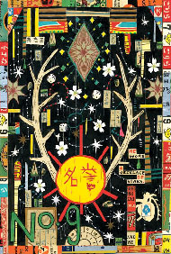
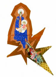
In the No, a thought-provoking exhibition at Edlin Gallery, challenges some of our basic assumptions about outsider artists. The mythology is that outsider artists exist in a state of “not knowing.” They live in a kind of innocent ignorance about the mainstream art scene and often about the world at large. The question becomes how much does our fascination with the artist’s own back-story affect our response to the work.

The six artists featured are all in one way or another “outsiders,” but to varying degrees. The question nags as one looks at the work: Is this work somehow more worthy because the artist is untrained, but naturally savvy? Or is that piece more or less “outsider” because the artist is art-school trained but mentally ill? The exhibition demands a self-reflective response from the viewer—do these things really matter when faced with a work of art that packs an immediate and emotional punch? Maybe.
The gallery does not offer answers to these questions, but it presents a brave and intriguing exhibition flor a venue where such notions of authenticity are its stock in trade. It is also presents an opportunity to seethe work of five diverse but equally interesting artists, none of whom I had ever seen before.

The work of Thomas Chapman faces this issue straight on. Easily the most compelling and interesting work in the show, it is also the work of someone with an extensive art-school background. I’m not sure that I buy the argument that he is attempting to “unlearn” his art-school training, but the work is terrific. Crazy-shaped canvases covered in debris, old carpet, paint and signs, they are a cacophony of modern urban life. A bombardment of images and color can be found all around the sides of the canvases. I find the abstracted pieces more interesting than the ones that address narrative. A modern-day Madonna and child appears contrived, especially when placed next to the abstract pieces that jump off the wall.

George Widener seems to fit the more typical profile of outsider artist. An autodidact living in rural North Carolina, he draws on stained napkins with a fine pen. Exquisitely intricate pen-and-ink drawings portray a world of infinite order and detail. In mapping a world of the mind, they are as elegant and sophisticated as the previous work is raw. These pieces certainly don’t need the title of “outsider art” to be valid statements. But then again, does being “outsider” make them more valuable?

Charles Steffan began art school in 1949, but he was forced to leave due to the onset of mental illness.He continued to make art until his death in 1995. The drawings on huge sheets of brown wrapping paper are both a verbal diary of day-to-day life and a visual window into the artist’s interior life. A mundane description of shoveling snow is juxtaposed with a gargantuan Cyclops figure whose deeply creased and reptilian skin (as well as his sharpened teeth) belie the gentle description of a snowy day.

Strolling through Chelsea or the Lower East Side you can encounter dozens of highly trained and over-intellectualized artists who work with forced and pretentious naiveté. It is a startling contrast to enjoy the work of those who not only walk the walk but also talk the talk.

Through June 20, Edlin Gallery, 529 W. 20th St. (betw. 10th & 11th Aves.), 212-206-9723. Call for gallery hours.

Posted in Reviews | Leave a comment

Pulling the Plug: Penny Rockwell’s work is, well, electric

Originally published Monday, March 9, 2009 by New York Press

  "Untitled (Plugs), 2000-03" by Penny Rockwell 
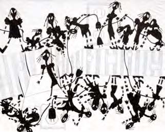
The work of Penny Rockwell, currently showing at Pavel Zoubock Gallery, is harrowing, intimate, sad and beautiful. She has documented with painful honesty the progression of a psychotic break that she suffered in the early 1990s, one fueled by paranoid delusions that electrical plugs were evil animated beings that were after her. After 10 years of therapy—and medication—she has attempted to recreate and communicate the absolute terror of this experience.

The exhibition is divided into three parts: The first, entitled “Evidence,” is a dense wall full of realistic and sinister drawings of industrial equipment, lamps and tools—all with prominent and menacing plugs. They are a studied and desperate attempt prove that the world is full of danger.

The second part is in a different drawing style and represents a small dark woman (or women) being chased and engulfed by plugs that are stylized with long fanglike prongs. The plugs are wildly animated. Snaking through rooms and up stairs, relentlessly pursuing the small cartoon women.

Some of the drawings depict an insanely detailed household; furniture and the ever-present plugs swirl into one and domesticity runs amok. The thing that saves this work from being just therapeutic is that the drawings are incredibly beautiful.

In black and white with a few strategic hits of color, they are skillfully composed and drawn. This is what makes this work transcend that of other “outsider” artists, who too often make work that needs a strong back-story in order to click. Often I feel drawn into the world of an outsider artist with a twinge of guilt—Rockwell’s work, however, gives me no such pains. The story of her descent into this mad world is both sad and interesting, and reading her narrative adds another valuable layer of understanding to the show, but it isn’t necessary. The work stands on its own as contemporary drawing, full stop.

The third section of the exhibition documents the artists’ stay in Bellevue. A dense cacophony of figures crowds into the drawing entitled “Untitled (Plugs)” Up, down, naked, eating, screaming, yawning—the full gamut of human behavior is crowded into this one dense drawing. Another depicts a snaking line of every variety of naked female waiting to bathe in one big, old-fashioned bathtub while a uniformed nurse screams for order.

Throughout all of the work, there is a powerful underlying sense of formal design and layout, bringing order to the madness of these drawings. There is structure beneath the work, perhaps the same structure that enabled Penny Rockwell to eventually find her way home.

Penny Rockwell: Plugs, Through Mar. 14, Pavel Zoubok Gallery 533 W. 23rd St. (betw. 10th & 11th Aves.), 212-675-7490.

Posted in Reviews | Leave a comment

Map Quest: Artists’ maps at Hebrew Union College

Originally published Tuesday, December 30, 2008 by New York Press

By Melissa Stern

“Budapest/Soweto” by William KentridgeThe current exhibition at Hebrew Union College Gallery seems particularly apt for 2008. Envisioning Maps is a giddy investigation of maps and more interestingly, the underlying concept of “mapping;” getting lost, getting found and staking out a place to belong in the world. Whether it’s a historical scarf mapping the invasion of Normandy or Paula Sher’s staggering, insanely wordy map of Israel and its neighbors, the desire to know where one is resonates loudly in a world where we don’t seem to know where we are going.

This is an exhaustive and surprisingly edgy exhibit. Thirty-three artists from a variety of backgrounds and geographies have each contributed artwork in a wide range of media. It all makes for an exhilarating and challenging show. The minute you walk in you are hit by Mike Howard’s giant (9’ x 14’) painting, “Leon Trotsky Murder Scene in Mexico City.” Boom! Curator Laura Kruger has just informed you that she intends this exhibition to examine the map as both political and personal animal. Nothing is neutral in this exhibition, and I like it like that. Many, but not all of the pieces refer to some aspect of the place of Jews in the world—a loaded subject if ever there was one. Kruger has managed to walk the line between disparate

politics, preferring to work with artists who approach the subject in a very personal and emotional way, rather than throw down an ideological gauntlet.

Karen Gunderson’s poetic portrait of the night sky takes on a deeper resonance when we read that she has recreated the constellations of Oct. 1, 1943, the night that the Jews of Denmark were due to be rounded up and deported to concentration camps. She depicts the sky looking north, towards Sweden, which is where 95% of the Danish Jews were smuggled to safety. It’s a work that succeeds at once as painting, as conceptual art and as a souvenir of history.

Imperialism, pollution and racism are addressed in various works, but always in a way that emphasizes their personal impact. Doug Beubhas studded a globe with matches; the world is literally ready to catch on fire. Paul Weisman’s woodcut of the toxic cloud that drifted from Chernobyl over Europe is at once formally beautiful and chilling. William Kentridge’s map entitled “Budapest/Soweto” connects the expulsion of one set of undesirables with the treatment of another.

One of the most chilling maps in the exhibition is “Neu-York” as envisioned by Melissa Gould. A lithograph map of New York City has been altered, painted over and renamed as if the city, having been taken over by the Germans, is now a mini-Berlin. It hits home when you try and find your home and realize that you now live on Adolph Hitler Plaatz.

Some of the most interesting works in the show are the historical novelty maps. The aforementioned scarf depicting the invasion of Normandy, “Our Way,” a board game for 1945’s immigrants to Palestine and an intricately detailed woodcut from 1581 entitled “The Entire World in a Cloverleaf” are each fascinating examples of how maps have been used by artists, politicians and visionaries to help us find our way in the world.

Through June 26, Jewish Institute of Religion Museum at Hebrew Union College, 1 W. 4th St. (at Broadway), 212-824-2205; times vary, FREE.

Posted in Reviews | Leave a comment