David Barnett: Sacred Creatures

Originally published May 19, 2010 by CityArts

No Longer EmptyViewing the deliciously obsessive art of David Barnett, one is drawn into his world of twisted Victoriana and mechanical madness. The exhibition at Denise Bibro Gallery is a combination of collage, found objects and extraordinary mechanisms fabricated by the artist. It is a complex show, and not everything works, but the pieces that do are knockouts.

Barnett has titled his exhibition Sacred Creatures after pieces early in the series that combine religious iconography with the imagery of flying insects. The exhibition quickly veers into other territory exploring family, history, flying machines and mechanical toys.

Exquisitely crafted, the sculptures are a delight. Tiny gears and minutely crafted mechanical apparatus turn the piece “Alb 09” into a marvel of engineering and design. An elongated mechanical flying machine, a sort of primitive helicopter, is constructed of delicate struts made of copper and brass. The front, like the prow of a ship, is a huge Victorian baby head collaged in old newsprint.

All of the sculptures are robust in design and execution. “Tin Man,” “Sir Oswald” and “Family Tree” are simply marvelous. Some of the pieces actually work via small motors that drive the Ferris wheel of “Family Tree” around in an awkward motion. Others imply the notion of work but are in fact static.

The collage pieces, of which there are many, are a bit problematic. Though elegant and perfectly executed, some of them lack the emotional punch of the three-dimensional works. The artist is so agile with the collage format that one can see how it is easy to slip into some more obvious visual solutions. Bugs, watch faces and angels, the stock imagery of Victoriana get a little overexposed. Nonetheless, some of the collages transcend the cloak of Victoriana and marry this nostalgic sensibility with the more contemporary. “Oscar,” a portrait in collage of the artist’s dog, is both tender and funny. It takes the craft of collage to a new and interesting place.

Through June 5. Denise Bibro Gallery, 529 W. 20th St., Ste. 4W,
212-647-7030.

Posted in Reviews | Leave a comment

Patricia Esquivias

Originally published May 19, 2010 by CityArts

It has long been my contention that video is the most challenging contemporary art form. The reason is that anyone can do it. Look at YouTube—who isn’t making videos? They are easy to make, but here’s the rub: it’s difficult to make them good and meaningful. The exhibition by Patricia Esquivias at Murray Guy is a prime example.

The show consists of two videos that are so amateurish in both concept and execution that it’s hard to know what to say about them. The first, “Natures at the Hand” is a group of three shorts, each about two minutes long. One is a woman throwing a basketball at an unbreakable window as the sun sets. It’s been edited so that the window hits coincide with the sinking sun. OK, I get it. The second is a close-up of a hand lighting matches from a collection of matchbooks. The third is a juxtaposition of images from books of European topiary and local topiary from Guadalajara, Mexico. Cute. Though the gallery press release praises Esquivias as a “storyteller,” there is no evidence of it in this unlinked group of videos. They are neither interesting visually nor compelling intellectually.

The second piece, “Folklore lll,” is more ambitious and indeed, it is more narrative than anything else. A complicated and hesitantly narrated story about two places that remain unnamed, this video seeks to make a story about buildings and “place.” There are references to pyramids, tile and a tourist attraction called Land’s End. However, without reading the gallery explanation of the narrative, it remains impenetrable. There is no beginning, middle or end to this story. I watched it twice, hoping for enlightenment.

Sometimes there’s just nothing on TV.

Through June 12. Murray Guy, 453 W. 17th St., 212-463-7372.

Posted in Reviews | Leave a comment

Douglas Florian at BravinLee Programs

Originally published May 11, 2010 by New York Press

No Longer EmptyWhat goes on in the mind of a children’s book illustrator. Rainbows and ponies and the sweetness of childhood? The exhibition of drawings by Douglas Florian (at BravinLee Programs through June 5) begs to differ. The exhibition peers into the far more complicated mental musings of an artist best known for his whimsical and gentle children’s book illustrations. The intriguing question is, are the inner workings of the artist’s psyche different from his commercial work?

These relatively small gauche and collage paintings are on one level an exploration of the raw, natural world, in all its messy beauty. Working on thickly gessoed brown paper bags, Florian paints in what feels like a stream of conscious. Shape and color flow and morph into vaguely recognizable objects from botany, anatomy and geology.

There is also a palpable eroticism to many of the pieces. In “QQ,” a hot pink sinewy line winds itself around and around the paper, curling into a final embryonic shape in the center of the paper. Punctuated by hits of brilliant turquoise paper, collaged onto the surface, the entire painting vibrates with the possibility of new beginnings.

Three related paintings entitled “My Mither’s Womb,” “And Eek Behind” and “Of Fumes and Fragrances” also address the intrigue of an interior private space. Bulbous turquoise forms tightly engulf smaller gray and orange shapes. There is a benign sense to these three—something (or things) is being held tightly, ready to burst, but not in a violent way. In fact, this sense of gentleness is the unifying theme of the entire body of work. Florian may be playing with ideas of nature, the psyche and a somewhat childlike vision of sex, but nothing jars the eye or mind. This is both a strength and weakness of the work.

Though everything is lovely, there is sameness in tone to this exhibition. It makes one yearn for an inelegant and impolite outburst of color of emotion. It is this very same sense of calm that inhabits the universe of drawings that Florian makes for children’s books. Maybe, in the end, the two bodies of work are not so different. Douglas Florian may actually see the world as a kind and gentle place as well as a visually rich and compelling one. And that’s not a bad thing.

Posted in Reviews | Leave a comment

Out Of The Black

Originally published April 20, 2010 by CityArts

“Black Teddy Iconic,” by Matt Campbell.

“Black Teddy Iconic,” by Matt Campbell.

If you like your art dark—well, cuddly and dark—then Out of the Black, an odd yet beautiful show at gallery hanahou, will satisfy nicely. The exhibition, by New Zealand artist Matt Campbell, hits a nerve with its combination of elegance and creepiness.

Campbell has collected a group of bedraggled stuffed animals and soaked them in some unspecified jet-black substance. According to the gallery, Campbell refuses to say what it is. The resulting toys look as if they have been dipped in tar.

The creatures are shiny and oily looking, though not to the touch. Their cute “furriness” is now stiffened permanently into awkward clumps and tufts. They remind me of pictures of birds caught in an oil slick; they don’t look dead, so much as frozen in time—although those cute little button eyes still twinkle back at you. And yet, there is an arresting beauty to these critters. Campbell has mounted them tastefully on posts, on shiny lacquered wood. They are presented like elegant specimens in a museum. Mounted with tiny magnets, they are designed to be removed from their posts, as if to be played with by the complicit viewer. When returned, they snap back onto their mounts in a crisp and satisfying way. The presentation is exquisite. Black animals mounted on white wall plaques line the gallery. Two perfectly placed creatures are mounted on black-on-black, just because it looks so good.

Campbell has written a statement about the work that links his vision to rampant consumerism, mankind’s disregard for the environment and “throwaway” culture. To me, the statement is an unfortunate detraction from the work. Shoehorning these fascinating and compelling sculptures into a political statement feels a little forced. My advice would be to skip the statement and enjoy this show in all of its elegant, creepy beauty.
>
Through April 30. gallery hanahou, 611 Broadway, Ste. 730, 646-486-6586.

Posted in Reviews | Leave a comment

Entomologia

Originally published March 24, 2010 by CityArts

“Caterpillar Doing Research,” by Lisa Wood.
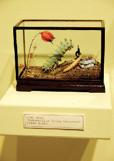
In the spirit of full disclosure, I admit that I love insects. Give me a Madagascar Hissing Cockroach, a dung beetle or a giant furry bumblebee, and I’m a happy camper. So it was with some bias that I journeyed to the edge of the Gowanus Canal last week to see Entomologia, an exhibition of artists who work with bugs and bug imagery. The exhibit is housed in a year-old exhibition space called The Observatory. Founded by a group of seven artists, The Observatory seeks to investigate “topics residing at the interstices of art and science, history and curiosity, magic and nature.” This exhibition fulfills their mission to perfection.

The small space contains works by 14 artists, ranging from the formal, scientific rendering of butterflies (Steve Thurston) to a giant contemporary photograph of a preying mantis that has just consumed its mate (Catherine Chalmers). A magnificent graphite drawing—nearly 8-feet-long, of the ventral view of a jewel bug—is by Joianne Bittle, who has rendered the insect in meticulous detail. The magnification of tiny details into huge, almost abstract shapes allows the drawing to leap back and forth between abstraction and hyper-realism. Though some of the artists employ digital methods and materials, a pleasing air of nostalgia pervades. The show is fairly formal, serious, even contemplative, allowing the sheer beauty of the creatures to stealthily sneak up on you.

The Observatory is wedged in-between several other eccentric and equally delightful exhibition spaces: The Morbid Anatomy Laboratory, The Reanimation Library and the Hall of the Gowanus. It all adds up to a delightful and uncompromisingly odd afternoon on the canal.

Through Apr. 4, The Observatory, 543 Union St., Brooklyn, observatoryroom.org

Posted in Reviews | Leave a comment

Passion Play

Originally published March 10, 2010 by CityArts

“Ecstasy,” by Lesley Dill
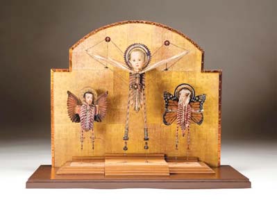
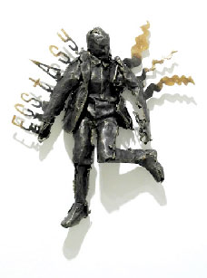
Lesley Dills’ new work, in paper and bronze, is literally full of the language and imagery of transcendence. Drawing on the words of several writers, but most notably Emily Dickinson, she has created a world in the process of “becoming.” Pieces titled “Rapture,” “Ecstasy” and “Joy” convey the excitement, passion and terror of a creative existence. The exhibition is simply thrilling.

George Adams Gallery has mounted the works in a way that allows for careful contemplation. The main gallery space is mostly given over to two large bronze figures. “Rapture” is a huge woman in a billowing dress. The perforations of her dress and body seem benign, and the words “rapture” and “germination” marching boldly up her arms suggest an organic rather than violent state of change. She is accompanied by a dark bronze man hanging on the wall, posed as if jumping rather than falling into space. Entitled “Faith,” the figure wears the words of Kafka on his chest: “Was he an animal that music had such an affect on him.” A fascinating pairing of sentiments.

Installed along one wall of the main gallery and in a small room, the small bronze and paper figures illustrate the words and sentiments of Kafka, Dickens, Espiru and Dickinson. Interestingly, all but two of the figures in the exhibition are men. The two lone women portray radically different emotional states. The aforementioned “Rapture” is staid and static. Her “sister” piece, titled “Spit/Bite,” portrays an upside-down woman thrown, jumping or falling through the air, her mouth expelling lethal-looking bronze sputum. The flip side of ecstasy, perhaps.

It is not a show for every taste. For those who do not relate to words in their art, the show will fall flat. And there are a few pieces in which I felt the words distracted from the image. However, for anyone who loves literature and language, it is a thoughtful and powerful exploration of the visual and verbal language of transcendence.

Through Mar. 27, George Adams Gallery, 525 W. 26th St., 212-564-8480.

Posted in Reviews | Leave a comment

Approaching Abstraction

Originally published February 24, 2010 by CityArts

“Untitled,” by Judith Scott
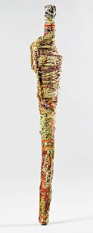
Traditionally, much of outsider art has been figurative. That’s in large part due to outsider art’s appeal to mainstream viewers: The work is a kind of skewed vision of the world as we know it. Like a funhouse mirror, the work of outsider artists portrays a world tweaked by the filters of madness, illiteracy, loneliness or any number of factors that renders someone “outside” of society.

The exhibition at The American Museum of Folk Art, however, attempts to show another aspect of outsider art, and it is one that relates the work much closer to modern and contemporary art. Approaching Abstraction showcases the work of 40 artists whose work tips over the line into “abstraction,” from those who obsess on numbers (Martin Thompson), materials (Judith Scott, Philadelphia Wireman, Mr. Imagination) or ritual (John Murray’s, Eugene Andolsek). These artists and others work in ways that belie the stereotyped forms of outsider art.

The exhibition is a little didactic, which appears to remain part of the mission of the American Folk Art Museum. I understand and respect this, but in some cases the work would be better served if it could just sing by itself, rather than be organized into categories such as “Obliterating Form” or “Distortion and Exaggeration.” The neat categories dampen the exuberant and original nature of the work a little; the explanation feels forced. But nothing can really hold it down. The pieces in Approaching Abstraction are as strong and worthwhile as anything that you will see in any museum in the city, with more than a few standout pieces.

William Hawkins is represented by a painting that is at once poetic and hilarious. The combination of corny collaged photographic images and Hawkins’ antic painting is fabulous. His black and white “modernist” building captures without guile the attempts of modernism to be neat, at the same time the building is beginning to bubble over with color and energy.

“Untitled (Vehicle)” by Dwight Mackintosh is a perfect example of the point that the curators of this exhibition are trying to make. A wonderful mass of lines, both calligraphic and abstract, pours across the paper, a treatise in an unknown language. At the bottom of the picture plane, perfectly placed, is a series of beautifully composed shapes that suggest the possibility of a vehicle. The balance of modernist color and tone—graphite, black and two great shades of yellow and orange—all combine to make this a terrific drawing, no other explanation needed.

I love the small wooden sculpture titled “Hens and Chicks With Rooster” by Leroy Person. Rough, but elegant forms are carved from wood and densely colored with crayon. These shapes are both something and not something—both hens and also just shapes.

A lovely and vibrant show, the work in this exhibition and genre and would stand on its own as fascinating contemporary art—outside categorization.

Approaching Abstraction, through Sept. 5. American Folk Art Museum, 45 W. 53rd St. , 212-265-1040.

Posted in Reviews | Leave a comment

Never Can Say Goodbye

Originally published January 26, 2010 by CityArts

No Longer EmptyIf you’re strolling past the corner of East Fourth Street and Broadway, site of the old Tower Records store, you’re likely to hear an unlikely sound coming from the building: music. Through Feb. 13, a scrappy and wonderful new not-for-profit group called No Longer Empty has commandeered the building and filled it with site-specific artwork—part of a show called Never Can Say Goodbye—that is all informed by that wonderful old-media phenomenon, the record store.

Walking into the space, you’re immediately greeted by Ryan Brennan’s “Bling Box Orchestra,” eight customized, 1980s-style boom boxes blasting the synchronized history of hip-hop music. It’s big, has lights flashing, and is really, really cool.

Ted Riederur has set up a fake record company called Never Records, and as you paw through the records bins you notice that each album cover is black except for a single word. Putting the words together, each bin spells a snippet of poetry. Like a surrealist parlor game, the results are both amusing and touching.

Paul Villinski has contributed another poetic and beautiful piece. “Diaspora” starts on the floor, a pile of old LPs, topped by a vintage record player. On the turntable a vinyl record has spun into the shape of a bird about to take flight. The entire wall above is covered with LP birds and the music soars into flight.

Deep in the back of the store, appropriately nestled into the former classical music section, is one of the most stunning video pieces I have ever seen. Joe Diebes has filmed a cellist playing a scherzo (the piece is not identified) with 10 cameras. The original piece is played very fast. He then deconstructed the film clips and reconstructed them in slightly “off” sequences into a new piece of film and audio that is thrilling in both image and sound.

Through Feb. 13. East 4th Street and Broadway, No Longer Empty.

Posted in Reviews | Leave a comment

Drawings for Crazy Horse

Originally published January 26, 2010 by CityArts

Crazy Horse Among Falling Stars by Tony FitzpatrickI have long been a fan of Tony Fitzpatrick’s eccentric and obsessive etchings. In the past he has turned his attention and finely-tuned hand to obsess on birds, bugs, hobo alphabets and the poetry of cities. In recent years he has moved increasingly into a new visual and conceptual universe, using collage to channel his obsessions into the visible world.

Fitzpatrick’s most recent show, at Pierogi Gallery in Williamsburg, is an interesting musing on the life of Crazy Horse. A cacophony of collaged images, many of which seem more autobiographical than biographical, crowd into the small drawings. The largest is roughly 10-by-7 inches, yet all are bursting with narrative, color and image. They are remarkable, the combination of size and density of color and image drawing the viewer into Fitzpatrick’s universe. The use of collaged materials has changed the artist’s palette. Though the work is both beautiful and seductive, I have to confess a longing for a greater presence of his “hand.” One of the best things about Fitzpatrick’s earlier prints were his extraordinary bold, funny and desperate hand-drawn lines.

Fitzpatrick is an artist who never sits still, and though I did not swoon over this body of work as I have in the past, the collages are thoughtful, worthy and wonderfully nuts. It is very telling that in the press release for this show Fitzpatrick readily acknowledges little knowledge of American Indian history or life and proclaims little kinship with the subject. But what fascinates the artist about Crazy Horse reveals much about Fitzpatrick; it is Crazy Horse’s unease in the world. Fitzpatrick describes him as a “seeker,” a man of both courage and “otherworldliness,” both an American iconoclast and an enigma. A portrait of the artist as a young Indian?

Through Feb. 7. Pierogi, 177 N. 9th St. (betw. Bedford & Driggs Aves.), Brooklyn, 718-599-2144.

Posted in Reviews | Leave a comment

Ending the Year on a Outside Note

orig. published December 30, 2009 by New York Press

Two very different exhibits with some similar ideas

David Dunlap Project #28

.

David Dunlap’s “Project Book #28.”

Two gallery shows in wildly disparate locations end 2009 on an interesting note. The first, on the outer edges of Red Hook, shows a diverse cross section of young Brooklynites. The second, in the heart of Chelsea, shows us the work of a mature but decidedly outsider artist working steadfastly for years with a uniquely personal vision.

Kidd Yellin Gallery is perched on a dead-end Red Hook street, almost in the river. It’s as “out there” as you can get and still be in New York City. The gallery has put together “The Kings County Biennial,” a huge, 48-artists show, culled from those working throughout Brooklyn.
While there are several noteworthy individual works, the show lacks an over-arching curatorial theme and is a bit of a conceptual mess; there’s a little bit of everything and it feels a wee bit frantic. Each of the artists has one piece in the show, though I felt it would have been a stronger show had there been half as many artists, each represented by more pieces. Still, there were a couple of standouts. Eric Fertman’s elegant sculpture entitled “Tower” is reminiscent of post-war modernism. Constructed of stained oak, it exhibits gorgeous craftsmanship and a feeling for form traveling through space. Similarly simple in appearance is a painting by Alejandro Cardenas. Entitled “Special Forces,” it is a haunting and affecting portrait of a mass of burka-shrouded women rendered as a landscape of staring eyes. It’s a powerful image, at once political and beautiful.

The other piece that impressed me was a video by Meredith James, which demonstrates real narrative and filmmaking skill. A surveillance monitor placed in a ridiculously small office, dating from a past era, and plays a continuous loop of a video about the same office and the security guard tormented by a constantly ringing telephone. Better yet, the monitor is placed in the office set in which the film takes place, providing a physical context that makes the sculpture work on several levels. It’s mysterious, funny and a little twisted—a recipe for great art.

Miles away, on one of the chic streets of Chelsea, one enters another “out there” place, but this by dint of concept rather than location. The Cue Foundation is presenting the New York debut show of David Dunlop. Dunlop, a resident of Iowa City, has been working on his idiosyncratic and very personal vision for over 20 years. Using sculpture, text, found objects, installation and photography, Dunlop lays bare both his life and artistic process. Though university educated, Dunlop is arguably a true outsider artist. The complexity and fully realized nature of the universe he inhabits is completely outside of mainstream art. It is funny, meaningful, provocative and utterly original.

The gallery is hung ceiling to floor with drawings, photographs, altered clothing and homemade calendars. In the center of the space is a big wooden cabin that houses, inside and out every single handmade book the artist has created since the 1970s. Recurrent themes echo throughout the enormous show—Martin Luther King, calendar dates, flags and politics. Dunlop does not have an agenda to pursue with all of these subjects. It’s more like a view inside of one man’s complex mind- obsessive phrases and imagery; the things that a mind latches onto and plays with verbally and figuratively. Operating on several levels, it is a show that deserves a very close look.

All in all, two very interesting ways to end the year.

> The Kings County Biennial
Through Feb. 26, Kidd Yellin Gallery, 133 Imlay St. (at Verona St.), Brooklyn, 917-860-1147.

>David Dunlap
Though Jan. 7, The Cue Foundation, 511 W. 25th St. (bet. 10th & 11th Aves.), 212-206-3583.

Posted in Reviews | Leave a comment