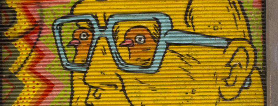
Here is Vanessa German’s website, take a look…..http://21stcenturyjuju.com
October 13, 2016 in Hyperallergic
A self-taught photographer, she began her career by making beautifully staged, highly dramatized photographs infused with the saturated colors of Southern California. Influenced by photographers such as William Eggleston and Cindy Sherman and by the Technicolor films of Hollywood in the 1950s and ‘60s, Prager’s transition from photography to film was a natural step. In 2010, she debuted her first short film, Despair. I must have watched it at least a dozen times when shown at The Museum of Modern Art’s New Photography exhibition in 2010. I was transfixed. In four minutes and 28 seconds, Prager tells a tale of love, loss, despair, and tragedy in the most elegant of ways. Everything about this film is tightly controlled, stylized, and brilliantly, beautifully fake. It set the stage for her following shows of photography and film, each more elaborate in style and delving deeper into the pathos of human relationships as well as an investigation into the genre of horror.
La Grande Sortie was commissioned by the Paris Opera Ballet and filmed in the Opera Bastille Theater, starring French ballet star Émilie Cozette with a supporting cast of retired dancers and teachers from the ballet company. I won’t reveal too much of the plot, because it would spoil the film — and believe me, you want to see this film unspoiled. Suffice it to say that the film is indeed about ballet. The production values are superb; Prager has studied closely the lighting, camera work, and stylistic flourishes of cinema from the ‘50s and ‘60s. Deep, dramatic shadows throw their cast across the screen, harsh light from below heightens the horror and drama in the story, camera angles are sharp, and the editing is fast.
La Grande Sortie develops themes now common to Prager, including a mesmerizing investigation into the nature of crowds: large groups of people that, Prager shows, are in fact small worlds unto themselves. This project, as with many of her previous, has a supporting cast of hundreds. In these crowd scenes she tends to cast people who are very distinctive looking — sometime ugly, sometimes eccentric, rarely beautiful. But the casting choices always underline the sense that while a crowd of people may seem anonymous it is in fact made up of hundreds of individuals, each with a story to tell. There is an odd and effective dance between the faces in the crowd: we move from our bemusement at Prager’s casting choices to the slow realization that all is not well with our heroine in the film. And there is a palpable tension between the portrayal of the seemingly innocent spectators — perhaps a metaphor for us, the viewers — and the protagonist.
Besides being visually interesting and often amusing (Prager often casts “types”: the businessman, the floozy, the sleazy guy) these mass groupings reinforce the purposeful artificiality of Prager’s work. It would be improbable to naturally find as many weird-looking people in a crowd as are in her universe. She never lets us forget for a moment that we are visitors in a made-up world, and there is never a pretense of reality in any of her work, no equivocation in her vision.
None of Pragers’ projects are shoestring budget affairs. She has embraced the Hollywood ethos wholeheartedly and made it work for her. The casts are big, the drama high, and there’s always a troubled dame at the center of the action. Her films also make extraordinary use of music. Like the cinemascope films of yesteryear the soundtracks swell and burst, carrying the audience along for an emotional ride. The score La Grande Sortie has been sampled from Stravinsky‘s Rite of Spring, (an already fraught piece of composition if ever there was one) and recomposed by Radiohead producer Nigel Godrich. It is stunning, and an equal match for the film.
The stills that accompany La Grande Sortie portray a theater as it is filling up with audience. They whisper, chew gum, look at their programs, and stare at the stage. The lighting changes in each photo (they are not hung progressively) so that in some we are looking at the eccentrics in the audience lit by bright house lights. In others the lights are dimming until finally we see, in two images, the room so dark that all that’s visible is the light barley licking the heads of several audience members, their faces deep in shadow. And in a final image, it is as if we the viewers were on stage, looking back at the audience as brilliant theatrical light blasts our faces. It’s an unsettling moment of recognition; this is what it’s like for a performer to step on stage. An audio loop of low-level ambient crowd noise plays throughout the gallery, a gentle backdrop to the photos.
These still images, which are on the ground floor of Lehman Maupin, set the stage for the darkened theater upstairs where the video plays. In this clever way the entire gallery has became a performance space. We enter and wander around, as if in the lobby of the theater, and then ascend to see the show with a sharply heightened sense of anticipation.
Prager’s fascination extends to a specific breed of horror film. A descendent of Alfred Hitchcock rather than Chucky or Saw, this is “horror” of a more genteel and perhaps more sinister nature. It is the emotional horror of our inner lives.
It would be fascinating to see what Prager might do with a longer story. On the other hand, I think that each of her films is exactly as long as it needs to be, and that is part of their great artistry. While opulent in visual impact they are in fact quite lean and focused in emotional content, making them all the more powerful. Like the best old Hollywood movies, I stumbled out into the bright daylight a little unnerved by what I had just seen. The only thing missing was the popcorn.
Alex Prager: La Grande Sortie continues at Lehmann Maupin (201 Chrystie St, Lower East Side, Manhattan) through October 23.
SHARE
TAGS
Alex Prager, Lehmann Maupin
in Hyperallergic. Sept. 26, 2016
KINGSTON, New York — Walking on John Street in Kingston on a rainy Saturday night my eye was caught by the oddest storefront on the block. Sandwiched between a tattoo parlor and an old office building is the tiniest of stores, measuring five feet wide by 15 feet long, with a long history. Originally the alleyway between buildings, the space was roofed over around the 1920s to become a jewelry store, then a Christian bookstore, a barbershop, a florist, and now the storefront studio of illustrator Matthew Pleva. Pleva’s space and work are part of the resurgence of the Hudson River city of Kingston, which has seen an extraordinary renaissance in the past five years. The combination of affordable studio and living spaces, proximity to New York City, and a close-knit and supportive artistic community is turning Kingston into a vibrant hub for creative types working in all mediums.
The original jewelry store sign still hangs above the door. It is an appropriate emblem for Pleva who makes drawings and dioramas of the most intimate scale. At SUNY Purchase, Pleva studied sculpture and printmaking, and after graduation became an apprentice to a commercial jeweler, working in the trade for 10 years. Both this background and the fact that Pleva’s father and grandfather were engineers inform his extraordinarily detailed and complex constructions.
In this perfectly tiny workshop and showroom, Pleva works with technical drawing pencils, creating illustrated narratives comprised of thousands of cross-hatched marks. He then painstakingly cuts out the drawings and mounts them on brass armatures, so that the drawn narrative becomes dimensional.
“My whole life I have always built things,” said Pleva. “My job as a bench jeweler satisfied that itch for a long time. Eventually I went back to basics — drawing. As a kid I loved making dioramas and then it all came together. ‘Let’s put it in a box.’”
Like modern-day medieval reliquaries, many of these pieces illustrate scenes from literary fiction of which Pleva is fond or illustrate significant moments in history. One of the more amusing ones, “July 20 1969,” depicting man landing on the moon, is housed in a vintage portable television of the era.
“Butcher” and “Gangs of New York,” each measuring one inch in diameter, illustrate two scenes from the film Gangs of New York in minute three-dimensional detail. Designed to be carried by the owner like a magical talisman or worn like the dioramas of old-fashioned watches is the amulet endearingly entitled “Jack the Ripper,” depicting the murderer in-action. It’s hard to know if these will serve to protect the bearer, but they are a technical tour de force.
Pleva has also translated his sensibility into slightly larger formats, creating dioramas out of found wooden boxes and advertising tins. These works are most successful in cases where the box and the narrative are related. For example, inside of a vintage World War l medic kit he has recreated a tiny scene from the movie MASH, his typical palette of black and white here illuminated by dark red crosses. This piece is particularly satisfying: The scale is small (9 1/4 by 3 31/4 inches) but big enough so that one can read the somber instructions on the tin box indicating how a tourniquet should be applied and instructions for wound care. Not just a mere reference to a pop-culture hit movie, the work has a real message. The connection between three wars (World War l, Korea, and Vietnam) paced roughly 40 years apart is a reminder of the sadly enduring constant of war in our lives.
In 2015 Pleva was again asked to design and paint a mural for O+. This piece, entitled “Robots!” (8 by 20 feet), is located in Chicago and seems far more dynamic. Pleva, perhaps more comfortable with the scale, employed dramatic diagonal bands of pattern that unite the wall in a very powerful way. He has since produced an elegant limited-edition print version of the mural image, a major difference being that he has adorned it with gold leaf, which adds a perfect hint of color and sheen to his rigorous black and white palette. The bands of gold become something for the eye to latch onto when trying to decipher the densely drawn science-fiction narrative: robots taking over the city, dodging sailboats and grabbing cars.
Both Pleva’s work and his space prove the truism that “small is beautiful.” But what save the artist and his gallery from cliché are his originality, inventiveness, and whimsy — all big reasons to make the small trip up the Hudson to Kingston, New York.
Matthew Pleva‘s store is located at 40 John Street in Kingston, New York.
May 6, 2016 in Hyperallergic
1:54 Contemporary African Art Fair 2016 continues at Pioneer Works (159 Pioneer Street, Red Hook, Brooklyn) through May 8.
1:54 Contemporary African Art Fair, A Palazzo Gallery, Afronova, Aida Muluneh, Amadou Sanogo, David Krut Projects, Edson Chagas, Frieze Week 2016, John Liebenberg, Lebohang Kganye, Magnin-A Gallery, Nontsikelelo Veleko
in Hyperallergic on April 28, 2016
For those unacquainted with Perry’s personal history and work, a brief digression may be helpful. After receiving a BA in Fine Art from Portsmouth Polytechnic, Perry lived in London, squatting for four years and dabbling in performance art and film. Introduced to ceramics by a roommate, he studied at the Central Institute, at first considering the medium a hobby. However, the very “uncool” nature of ceramics, the fact that it was considered kind of “middle class” and not “real” art by the mainstream British art world, where ceramics was, for the most part, still considered “craft” perfectly suited both Perry’s political and artistic proclivities, and added to the medium’s appeal. Drawn to the prosaic qualities of pottery, and its association with domesticity, Perry found he could tell his stories on classical ceramic pot forms with layer upon layer of glorious, glazed color, metallic luster, texture, and text. Using ceramic decals, he incorporates pop, personal and media imagery, which, alongside with his intricate, flowing drawing give a punch to his subject matter that few other mediums can.
And it was Perry’s subject matter that really thrust him into a spotlight which no potter before or since has found themselves. Perry’s pottery depicts a psychosexual world that many found disturbing (although I also see great humor in much of what he makes). He has mused upon child abuse, his own sexual life, fantasies, fear, anger, gentrification, politics, and capitalism. In short, he chronicles the deepest and often most conflicted feelings that a person may have, expressing subjects that are politically charged in an art form most commonly associated with genteel life.
Perry’s narratives swirl around the outside of the pot. Like a neurotic who retells a story over and over again, his beginnings are always the end. The pottery’s layers of drawing and color are like pentimento fragments of memory haunting the storyteller. It’s rare that an artist is confident and bold enough to express both deeply intimate and political issues all together, and particularly in the medium of ceramics. Perry has a superb control of the medium — glazed surfaces can radically change when fired and the ability to hang onto both the messages in his work and the aesthetics is impressive.
Grayson Perry has been a transvestite since he was a teenager. Much has been made of this by the media and by the artist himself. The BBC reported on December 7, 2003, the following account of the Turner Award ceremony: “Wearing a purple dress with large bows and frills, Perry told a ceremony at the Tate Britain gallery in London, ‘Well, it’s about time a transvestite potter won the Turner Prize. I think the art world had more trouble coming to terms with me being a potter than my choice of frocks.’” Apparently, a fear of pottery trumps transvestitism.
Grayson Perry, Museum of Contemporary Art Australia, Pottery William Hogarth,
SAN FRANCISCO — The 1960s upset the status quo in nearly all realms of American life. The decade issued radical ways of thinking about, making, performing, and exhibiting art, and San Francisco was at the vanguard. In 1970, the Arts Commission of the City of San Francisco, feeling that there needed to be an alternative way to present new art to the city, opened an alternative art space. The name? “Capricorn Asunder,” no less! No one is quite sure where the name came from, but it morphed eventually into the San Francisco Arts Commission (SFAC) Galleries, a more prosaic moniker for what has become a vital and growing part of the Bay Area art scene. The main contemporary gallery bounced around the Civic Center neighborhood, inhabiting various temporary spaces before closing its doors in 2013 in preparation for the move into the new space.
Now, nearly 50 years later, the city has renewed its commitment to the value of municipal alternative art and opened a 4,000-square-foot gallery and community space in the recently renovated Veterans Building in downtown San Francisco. The gallery, which had its public opening on January 22 with a crowd of well over 1,000 Bay Area arts supporters and artists, joins two other spaces that the Arts Commission runs in the same Civic Center neighborhood. One, the SFAC Galleries Art at City Hall, exhibits both fine art and editorial photography with a strong focus on civic and social issues; the other, the SFAC Galleries Window Installation Site, is primarily an installation space, with large windows onto the street that allow near-constant interaction with the public. The three spaces make up a triad of contemporary art public programming, shepherded by longtime Gallery Director and Curator Meg Shiffler, that is both ambitious and accomplished, addressing local art interests while embracing the broader international art world.
The $156 million renovation of San Francisco’s historic Veterans Building was needed desperately to address both seismic and aesthetic concerns. The once-glorious structure, built in 1931, was showing its age and needed to be brought up to modern earthquake codes. Rolling the construction of a new SFAC gallery into this massive project made sense: The building hosts programs and offices for war veterans, a variety of art organizations, and contains the 900-seat Herbst Theatre as well as the brand new San Francisco Opera Lab, a new space devoted to contemporary vocal music.
In a region where shifting demographics has caused rents to skyrocket, driving out longtime residents and artists (sound familiar New Yorkers?) this is not only a welcome addition to an endangered local art scene but a determined stance by the City of San Francisco to try to keep the city viable for its artistic community. Twitter, Uber, and Dropbox, to name only a few, have all moved into the city, many of them into the South of Market area that had traditionally housed small alternative spaces and galleries. In the past two years, many downtown San Francisco commercial galleries have either closed or been forced to move because of escalating rents that make NYC look like a bargain.
I stopped by the Veterans Building to chat with Shiffler. I was curious about the very notion of a “municipal gallery” and its importance to San Francisco. “Municipal galleries come in all shapes and sizes,” said Shiffler, “but most commonly they are nontraditional spaces, or interstitial spaces in public buildings that house artwork by local artists.” According to her, municipal exhibitions are often curated by a peer panel and coordinated by an Arts Commission or Department of Cultural Affairs. In addition to these smaller programs, there are municipal galleries that rival mainstream museums, such as the City of Chicago’s program at the Chicago Cultural Center, or LA’s Municipal Art Gallery housed in a Frank Lloyd Wright structure in Barnsdall Art Center.
Shiffler continued, “One of the differences in San Francisco is that the programs have always been lead by a director/curator, which has allowed the SFAC Galleries to establish a strong, ever-evolving, and particular aesthetic identity, at times quite radical.”
Though the three galleries frequently show artists of international stature, their primary curatorial focus remains on the Bay Area art scene. Inaugural exhibitions in the new space include, Bring It Home: (Re)Locating Cultural Legacy Through the Body, a group exhibition of Bay Area artists examining issues of cultural identity; Susan O’Malley: Do More of What You Love, a posthumous exhibit of the young artist’s work and legacy; and ENTER: 126: Coalescence, by Annette Jannotta and Olivia Ting, the first of a new yearly site-specific commission program.
This very public display of support should be applauded in a time when cities are strapped for funds and the arts often slip down the list of perceived importance. While the SFAC can’t rescue artists from high rent and shrinking real estate, and while it can’t claim to represent all of the Bay Area’s art community, it is a uniquely local institution, one that has nurtured artists for half a century.
The new San Francisco Arts Commission (SFAC) Main Gallery is now open at 401 Van Ness, Ste. 126, San Francisco.
In October 2015 the first children’s museum in Harlem opened its doors. The Sugar Hill Children’s Museum of Art & Storytelling occupies the first and lower floors of a stunning building designed by David Adjaye. The building also houses 191,000 square feet of affordable housing and has been praised as a model for mixed income and mixed-use development in New York City.
The museum inaugurated the opening with several exhibitions, each curated with children in mind, but by no means pandering or dumbing down the artistic mission. The most ambitious of the exhibitions is Txt: art, language, media, a mixed-media show exploring the inclusion of text in the work of 12 contemporary artists. The show has been co-curated by Rocío Aranda-Alvarado from El Museo del Barrio and Lauren Kelley, associate director and head of curatorial programs at the Sugar Hill Museum.
First, I must applaud the curatorial team for having the vision to paint one wall of the exhibition a stunning brilliant pink. I love it when curators forgo the neutral “box” of the traditional gallery model and incorporate the architecture of the room into the installation. Make no mistake, this is not a “kiddie” pink; this is a shade of pink that has real balls. The pieces that are shown on the wall have a visual pop that delights the eye.
With an emphasis on local artists, the exhibition explores the nature of “conversation” — the kind a viewer can have with an artwork — and how its very definition can change across media. I found the most successful pieces in the show to be ones that used “old media” sculpture, like drawing and objects, rather than some of the “new media” works (two of which weren’t working when I visited, an endemic problem of tech-reliant artwork).
Korean-born, New York-based Hong Seon Jang, for instance, has created a three-dimensional portrait of New York City out of pieces of letterpress type. The type is widely varying in height, font, and size. Entitled “Type City” (2015), it’s clearly a riff on the famous “Panorama of the City of New York” that resides at the Queens Museum (a scale miniature model of the city that was commissioned for the 1964 World’s Fair). The use of metal type is clever, as it renders buildings into abstract objects, identifiable letters, and pure texture. A triad that is delightful to look at and an insightful representation of our city.
Brooklyn native Iviva Olenick is represented by 15 framed drawings, hung together like a puzzle in a single block. “Post-It/ Tweets; Selfies and Lettergrams” portrays the artist’s life as seen through social media. Embroidered lines of text reveal tidbits of chat, gathered from her personal social media conversations. The embroideries are then incorporated into loose watercolor paintings that compose a portrait of the person (or persons) whom the artist is having a conversation with. Containing poetic hints about the relationships between Olenick and her friends and family members, and strangers, the drawings memorialize her online interactions.
The boldest statement in the exhibition is a made by Antonia Perez. She has crocheted a large rug out of plastic bags. Embedded in the colorful and decorative patterns of the rug is the message, “Estas En Tu Casa” (which is also the title of the piece). Interestingly, when I looked this up for translation online I was offered an interesting variation of formal and colloquial meanings. From “Make Yourself at Home” to “You are at Home” to the literal “Are you at Home.” They all work, in subtle ways, in the context of the artwork. A rug made of cast-off bags with this message leads to interesting questions (and remember this is a show pitched for children): Is this a comment on homelessness? The ways in which we make a home for ourselves? Is it a comment on the environment and the waste all around us? The wall title doesn’t give any hints, but I see it as a jumping-off point for conversation. As an aside, the rug is beautiful, a geometric patchwork of strong colors and linear design.
The inclusion of Vuk Ćosić in this show is an interesting addition. Ćosić has been credited with the invention of “net.art,” a digital platform that elevated the use of basic pixels and basic computer code (0’s and 1’s) to an art form. An early proponent of computer code as art, he mixes political, social, and aesthetic commentary into pixilated, mesmerizing videos. In the video included in this show, “Bruce Lee, King Kong, Mickey Mouse, Singing in the Rain” (2009), he has edited the films together into an amusing mash-up of cultural icons, all hierarchies erased by reducing all images to “0” or “1.” The visual text is seamlessly united with the very essence of computer language.
It’s a rich show, full of unexpected artworks that all circle around a common theme. But the show could have easily been larger. There are so many artists working with the theme of “text” that I would have loved to have seen this show expand into a fuller representation of that theme. However, this ambitious exhibit harbors the promise that future shows will continue to redefine “children’s art” and challenge our notions of what children have the patience and interest to look at. This is an exhibition approachable by those of all ages, and marks a auspicious start for a new Harlem arts institution.
Txt: art, language, media continues at the Sugar Hill Children’s Museum of Art & Storytelling (898 St Nicholas Ave, Harlem, Manhattan) through February 14.
In Hyperallergic January 15, 2016
Mary Bauermeister, “Lens Box Pencil Theater” (1969), mixed-media assemblage, 6 x 6 x 4 1/2 inches (all images courtesy Pavel Zoubok Gallery, New York, unless otherwise noted)
You might want to bring your reading glasses to The Tiny Picture Show at Pavel Zoubok Gallery, because some of the suckers on view are really tiny. From the smallest piece in the show — a painting by Alfred Leslie (“Untitled,” 1960) coming in at a massive 1 3/8 x 2 inches — to the largest — a Tom Wesselmann (“Judy,” 1959), 7 3/4 x 6 1/4 inches — the gallery is a jewel box full of tiny surprises.
Historically, collage and assemblage have often been associated with “smallness.” Think of Victorian scrapbooking, decoupage art, or the works of Joseph Cornell. In the mid-20th century, however, artists like Romare Bearden, Jean Dubuffet, and Robert Rauschenberg blew up the scale of these two genres, and they became part of the mainstream art world. The Tiny Picture Show refocuses our attention on the enormous visual and emotional possibilities in artworks that are very, very small.
Installation view of ‘The Tiny Picture Show’ at Pavel Zoubok Gallery, New York
The show is beautifully installed with 62 works of art hung so that visual and conceptual connections are made between artists whom you might never have thought of together. On the same wall, we see an almost dizzying array of artists and styles: Ellsworth Kelly, James Garrett Faulkner, Max Greis, Javier Pinon, David Wojnarowicz, Marcel Jean, Wallace Berman, H.C. Westerman, Marietta Ganapin, Mark Wagner, Chambliss Giobbi, John Ashbery, and John O’Reilly. The rest of the exhibition has some equally stunning pairings. The three distinctive visions of Ray Johnson, Arman, and Al Hansen work in harmony: Johnson’s enigmatic images of seemingly unrelated objects and words work beautifully with the tiny collection of old clock faces that Arman assembled in a round box, which in turn resonate off of Al Hansen’s collage of jumbled red letters in a classical gold frame. To me, the three pieces are like clues in a mystery story — all of the elements are there for viewers to create their own narrative.
Jacques Villeglé, “Rue de la Convention September” (1973), décollage on original mount, 3 3/4 x 7 3/8 inches (courtesy Ubu Gallery, New York)
The earliest work in the show is Joseph Stella’s “Black Descending” (1920–22) and is representative of the modernist aesthetic of the era. Works from the 1960s, ‘70s, and early 21st century are plentiful, but there is work from every era between the early 20th century and 2015. An impressive curatorial achievement, to be sure. The gallery, which is devoted to displaying collage and assemblage, seems to be saying that though the individual pieces may be diminutive, their collective artistic power has amounted to something quite meaningful.
Among the standout pieces in the show are Jacques Villeglé’s, an artist well known for his work from the late 1940s onward, often called “decollage,” where he created works by subtracting, rather than adding, visual elements, such as by peeling away layers of images. Previous to this show, I had only seen very large pieces of his: big panels, thick with layer upon layer of advertising posters that he found on the streets of Paris. He is represented here by an exquisite piece of torn paper on board entitled “Rue de la Convention September” (1973), a seemingly simple horizontal piece measuring just about 3 by 7 inches. Hints of brilliant pink, red, and orange are interspersed with a bit of the letter “E” and a torn “O.” In between the areas of color there are many subtle shades of white. This deceptively simple composition is quite elegant and the gallery has hung it on a wall, almost by itself so it sings alone.
Lance Letscher, “Paper Clip” (2015), collage, 6 1/4 x 4 1/4 inches
One of the fascinating things about The Tiny Picture Show is the sense of individual discovery that comes from looking closely. Another viewer will find different gems; it is a show ripe with encounters that is not to be rushed through. The size of everything here forces the viewer to slow down in order to really focus on the artwork — if size indeed matters, then this exhibition would argue for the power of the small over the large. And I would have to agree.
The Tiny Picture Show continues at the Pavel Zobouk Gallery (531 West 26th Street, Chelsea, New York) through January 23.
posted in Hyperallergic December 7, 2015
Over the past several years the Gagosian Gallery in New York City has mounted shows described as “museum quality.” Borrowing heavily from institutions and private collectors these exhibitions such as Jean-Michel Basquiat (2013), the Takashi Murakami exhibition (2014), Picasso & the Camera (2014), and the two-part exhibition In the Studio (2015) all wowed New Yorkers with their breadth and depth. Each drew impressive crowds — with lines down the block — for a commercial gallery.
The most recent show Francis Bacon: Late Paintings is perhaps the most stunning of them all. Not because of size; in fact, it’s probably the smallest of all the aforementioned blockbusters. Twenty-seven paintings all made in the last two decades or so of Bacon’s turbulent life have been hung on mushroom-colored walls on the two floors of Gagosian’s Madison Avenue gallery. The works are complemented by a hallway exhibit of candid personal photographs of Bacon taken by Eddy Batache, mostly shot in the mid-1980s, in which Bacon appears almost happy, an occasional flutter of a smile replacing his usual look of utter despair.
Having not really focused on Bacon’s work in quite a while I was blown away by how fresh, shocking, and incredibly beautiful the paintings are. His work seems to be a lightening rod for strong reaction. From Jerry Saltz’s fierce review of the 2009 retrospective of Bacon’s work at the Metropolitan Museum of Art to the group of ladies on an art tour, who were at the gallery the day I visited and left muttering “too hard.” Indeed, a group young art students in the gallery were so moved that they were almost unable to speak when asked what they thought of the show.
The paintings in the exhibit reflect a change of mood in Bacon’s work over time. Work of the earlier decades portray the agonies of man, masses of ectoplasm, flesh, bone, and loneliness, whereas his later works give way to calmer psycho-landscapes. Gone are the piles of flesh, replaced by a vision more stripped to its essentials, both in terms of painting and psychology.
There is, of course, that gorgeous color that Bacon’s work has characteristically employed. His palette has always been sophisticated. Pairings of brilliant oranges and reds with cool blues and greens, and of odd, neutral tones with warm black set the images in motion. The work is both aggressively modernist, reflecting a color palette that was initially used in fashion and interior design in the ‘60s and 70s (look at Rudi Gernreich’s clothes and Harry Bertoia’s furniture) and is distinctly 20th century. The use of oil pastel in conjunction with oil paint contributes to many of the urgent gestures in these works as well as the delicate veils of color we see.
All of this sublime color of course belies the deep psychological trauma and loneliness of the figures that inhabit Bacon’s world. The later paintings more often than not portray a solitary figure constrained by the suggestion of a geometric architecture. In the triptychs, there is a single figure in each frame. As always, Bacon walks the line between figuration and abstraction. “Figure in Movement” (1978) can be seen as an acrobat caught in movement, the backdrop and suggestion of a painted ring hinting at a performance. Or one may look at the work as the interplay of form, color, and paint, the figure reduced to a tangle of strong, abstracted forms. The kicker in this painting is the purple shadow that lies underneath the figure. The shadow, which appears as a standing figure with hands on its hips, bears no relation to the movement or figure above, suggesting that it is perhaps someone else’s shadow, a watcher of some sort, and perhaps it is we who are the watchers, a tacit acknowledgement of the relationship between the painter and the viewer. It is part of the mystery of the narrative.
“In Study From the Male Body” (1986) Bacon has placed a male nude on what could be a sculpture stand or a piece of mid-century furniture. The figure sits in an awkward pose, head looking right, torso dissolved into vague outlines of muscle and flesh. There is a very odd spatial game in this painting. It’s impossible to tell whether the architecture is advancing or receding — everything is out of whack here in time, space, and mind. The architectural black square behind the figure’s head melts and merges with the body, a depiction painted in beautiful, glowing color, like darkness descending over the mind.
Much of the overt pain and fear of Bacon’s earlier work from the 1940s seems to turn inward in the ‘70s and ‘80s. These paintings are more contemplative. We see few of the screaming rictuses that haunted the paintings of the 1940s; rather, that pain feels more muted. The small portraits that hang interspersed between the huge canvases seem to be exploring form and abstraction, rather than the “horror” often attributed to Bacon’s portraits. In “Study for a Portrait” (1978) we see a placid male face, perhaps painted from a photograph, as Bacon was known to prefer this to painting from life. The face is defined by pastel forms and gesture begins to take over figuration. Bacon has begun to carve the face, not in a gristly way, but into abstraction. The concrete forms have begun to be more prominent than the flesh of the man beneath them.
If you didn’t already like Francis Bacon’s work, this exhibition may not change your mind. However, perhaps those who found Bacon’s early work too graphic and too “fleshy” will be drawn in by the sheer beauty of his painting as well as by what some might perceive as a more palatable sensibility. These later paintings convey both a technical mastery and the self-reflectiveness of an artist who had entered a new phase of maturity.
Francis Bacon: Late Paintings continues at Gagosian Gallery (980 Madison Avenue, Upper East Side, Manhattan) through December 12.
Gagosian Gallery, Francis Bacon